Photo by: Hailei Sorgenfrei
A one paragraph description of your photo; what you attempted to do, anything you tried that was unique, any manipulation of the camera to get the shot, anything special or unique about the photo, are you happy with the results, what would you do differently, etc. You will not earn full credit if you say you really liked the photo because it was cool!!!
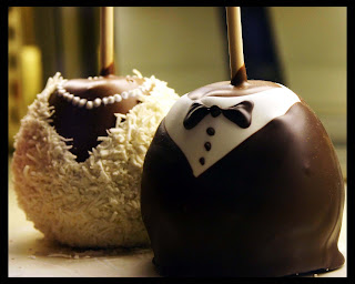
This is a photo of two candied apples in a bakery in Seattle. The apples were on display behind glass so it was tricky to not get a reflection in the picture. I love this picture because I think the tux and wedding dress on the apples was a brilliant idea and it was cool to be able to photograph something so unique. I’m pretty happy with the way it turned out and how clear the tux apple is. I used Photoshop to add a black border as a frame to bring out the picture and to crop it a little.
13 comments:
I love the lighting in this photo it fits the mood. I also like that you had the background out of focuses because it would have been to bizzy if it was all in focuses.
ERHS
-Katie F
The lighting of this photo sets the mood very well though, I think is should be a little lighter. The apple tux is in perfect focus. The way you arranged the two apples on a diagonal angel is very eye appealing.
AML-ERHS
this picture is just awesome. This looks like a professional took this picture. I think the colors look great and its just cute anyways. I cant tell at all that you took this through glass. The lighting looks like it was taken in a studio.
AH SPHS
This picture is adorable. I agree that you cat even tell you took it through glass, very good. This picture def fills the frame very well! Cute picture.
hm, sphs.
I love this photo. It is so cuuuutttee. They make me hungry and happy at the same time. So give yourself a pat on the back. I would have tried to put the photo in a different background. But I understand that you couldn't really control the background. However, if you made a composite I think it would have helped because the background kind of detracts from the overall picture. Also, the lighting is not too great. But, once again, I concede that you really did not have much of a choice as to where you could place the apples. Overall, I like your subject. I might have tried to take it from a few different angles. Overall really cure
I really like the lighting in this photo! It's a cute little photo and has great focus. It looks really good with he background blurred out.
This is a very cute picture! i love the lighting coming from the back and the little details that you can see on each apple. I like the fact that the background is slightly blurred because it really make you focus on the apples. Good job.
K.S.-SPHS
This picture is interesting because of how the candies are in focus and the background isn’t, it gives the picture more depth. I like how you added a border; it gave the picture more character.
-KD,ERHS
I really like this photo. It is very creative and I like how the apples are in focus and then the background is not. I like how clean the lines are on the apples. I think that it makes the picture 10 times better. I really like the compensation of this photo. I like how the apples fill the frame and they are the main thing that you look at. My over all view is great. I like everything about it and there is nothing I would change.
EKOHS
This picture is really cute. The clarity is really well. Taking pictures of food is a challenge, let along through a window, and I would like to complement you on that.
ERHS-SM
This picture is so different. I really like the idea of the tux and wedding dress. You did a great job keeping out a reflection and i love the lighting and how it sets a good mood. Great job!
Wow. These look so delicious. I love how the depth of field is right on the apples. I also love how you can see the detail really well. The only thing it the bumps in the apple with the tux...I think if you had cloned them out it would have looked better. I also think the coconut or whatever is on the bride's apple that is on the counter would look better if there wasn't some on the counter. It is a little distracting. Other than that I really like this picture. It is very interesting and different! Good job!
This picture is really cute! I like the simplicity of the photo. The focus is great, I like the way the background is really blurry. Good job with shooting through the glass!
MH- ERHS
Post a Comment